FDNY Yankees
Client: Michael Farrugia
For this project, I partnered with the FDNY to create custom swag for their attendance at a Yankees game. While the client initially approached me with a few design ideas, I took the lead in developing original concepts using Adobe Illustrator. Throughout the process, we collaborated closely via email, exchanging feedback and refining the designs. I maintained clear communication and responded promptly to ensure a smooth and efficient workflow, delivering high-quality visuals with quick turnaround times. Once the mockups were approved, I prepared the art files, ordered DTF (Direct-to-Film) transfers, and coordinated production to ensure everything was completed on time. Strong communication and proactive project management were key to delivering a smooth and successful outcome.
Final
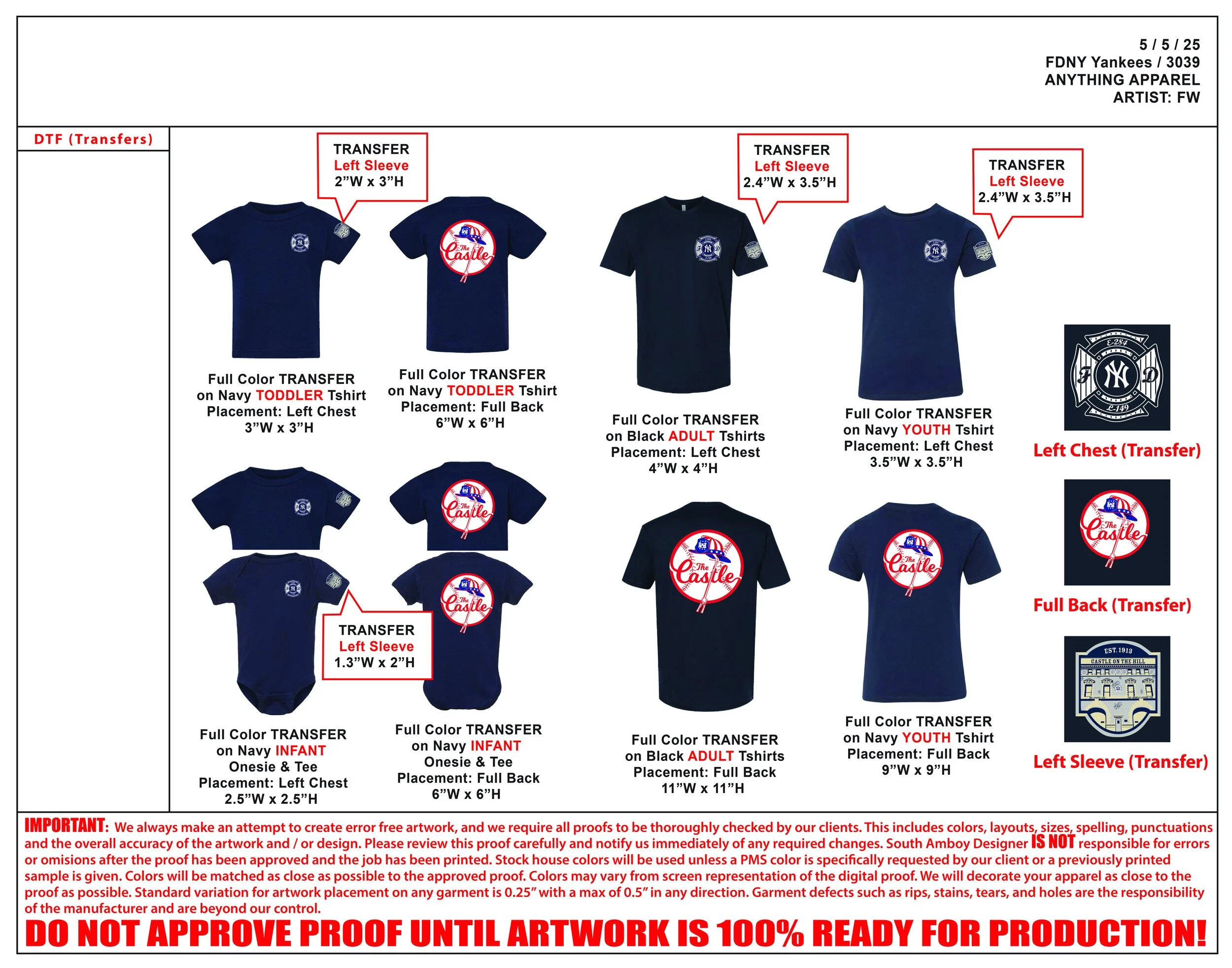
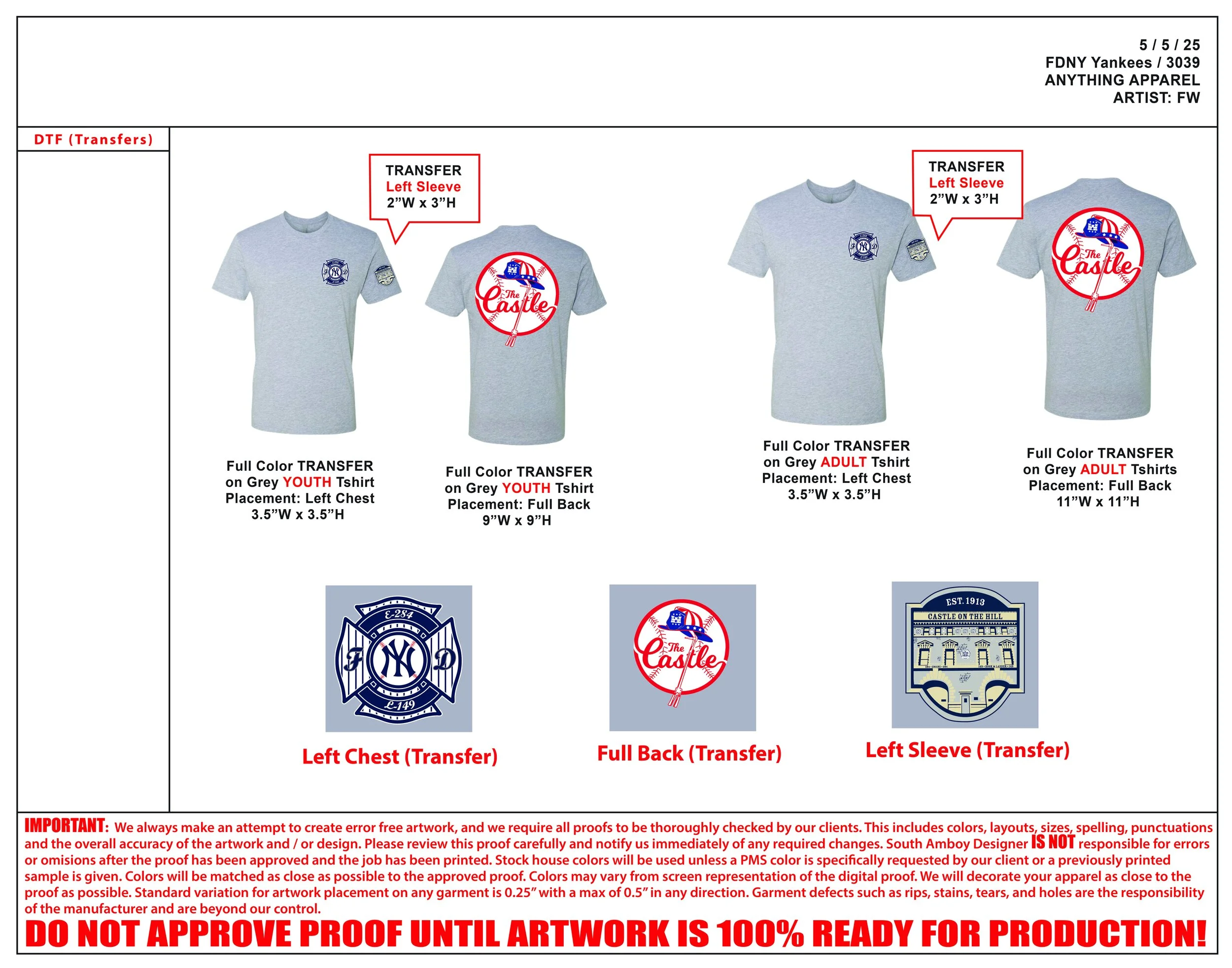
The final designs were tailored to complement the garment colors, with adjustments made to ensure strong contrast and visual impact. Each piece featured three design placements: Left Chest, Left Sleeve, and Full Back. I created mockups to clearly show how the artwork would appear on different shirt colors, helping the client visualize the final product before production.
Progress
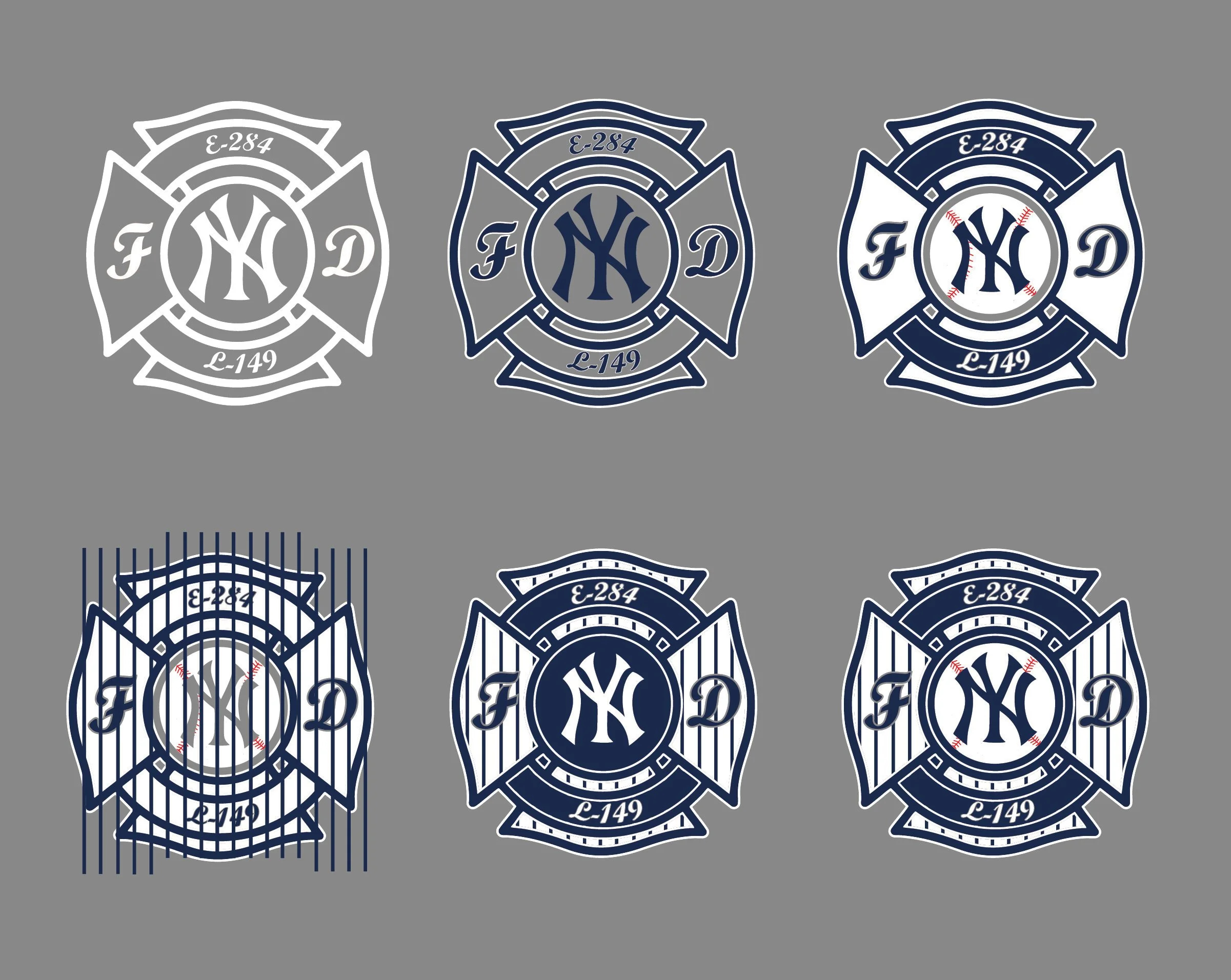
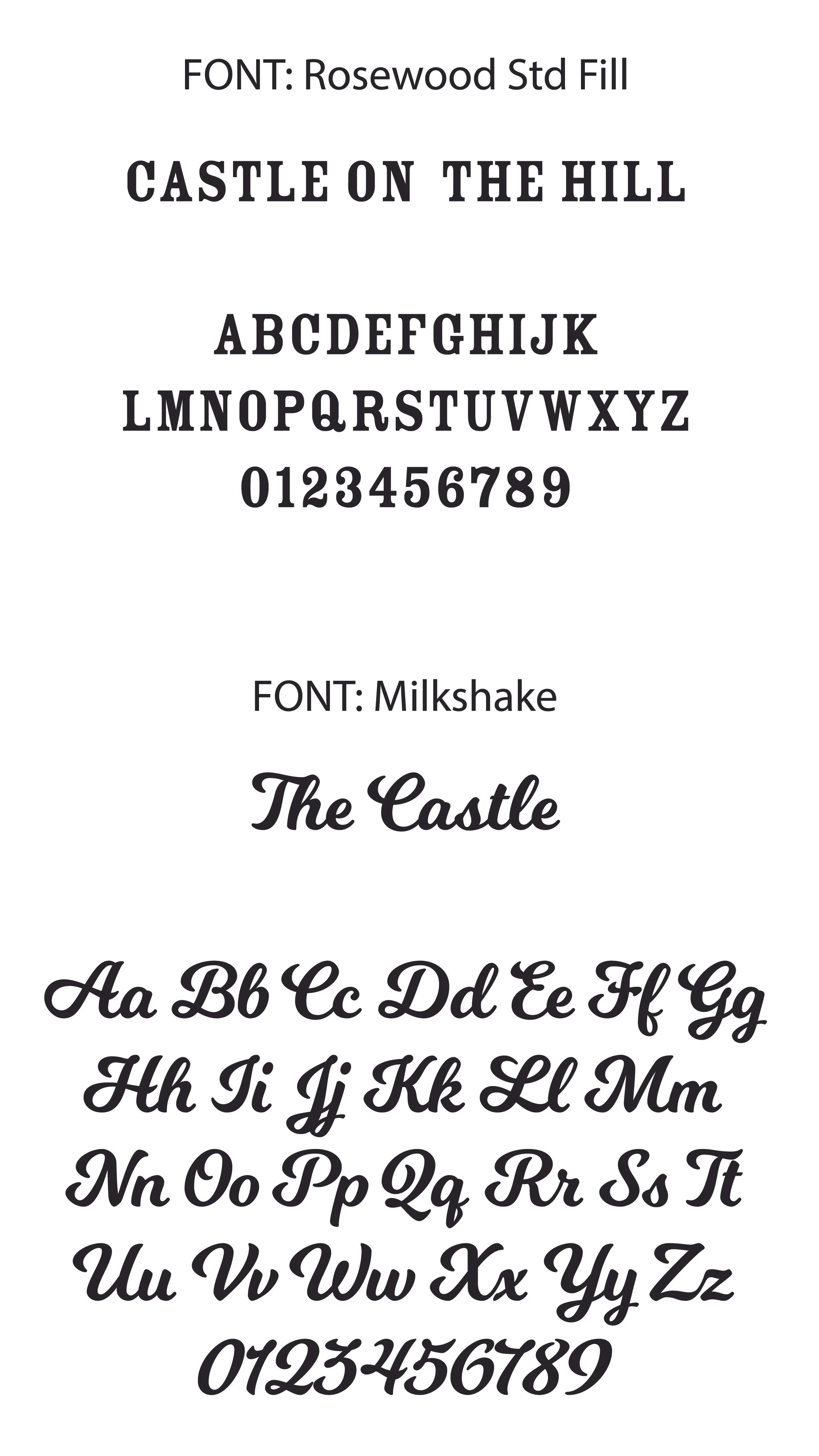
This section showcases the development of the FDNY Game Day swag, from initial concept to final design. The client requested a design that paid homage to both the Yankees and the FDNY, with the specific ask to mimic the Yankees logo font. I sourced a font that closely resembled it and built the rest of the design around that foundation. From the start, the client specified two different shirt colors, which required adaptive color palettes to ensure the designs stood out on each garment.
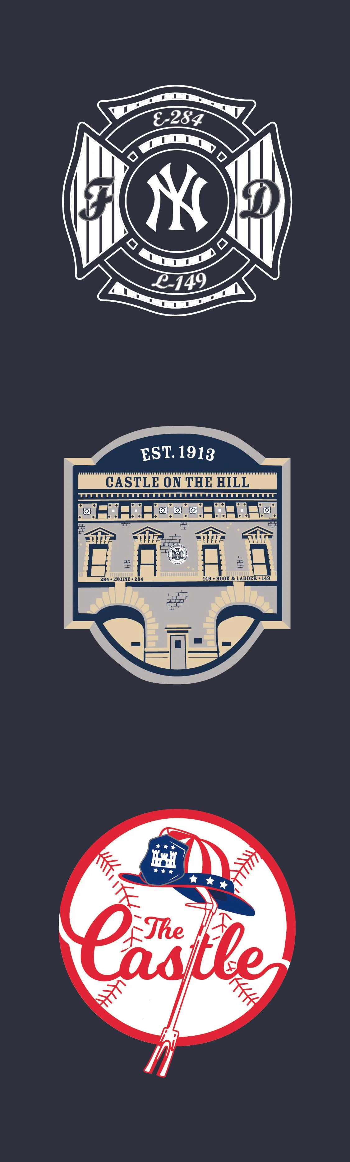
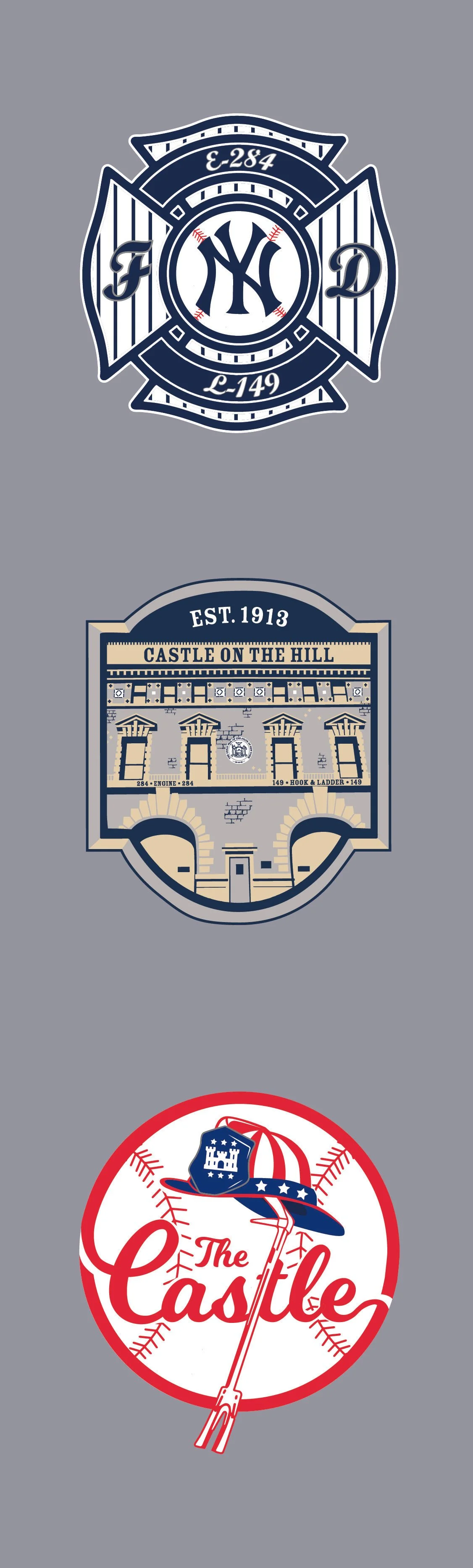
For the Left Chest, I incorporated the iconic Maltese Cross—symbolizing heroism and fire service—along with the Yankees logo and the station numbers. It also featured the iconic Yankees pinstripe design—simple, clean, and instantly recognizable.
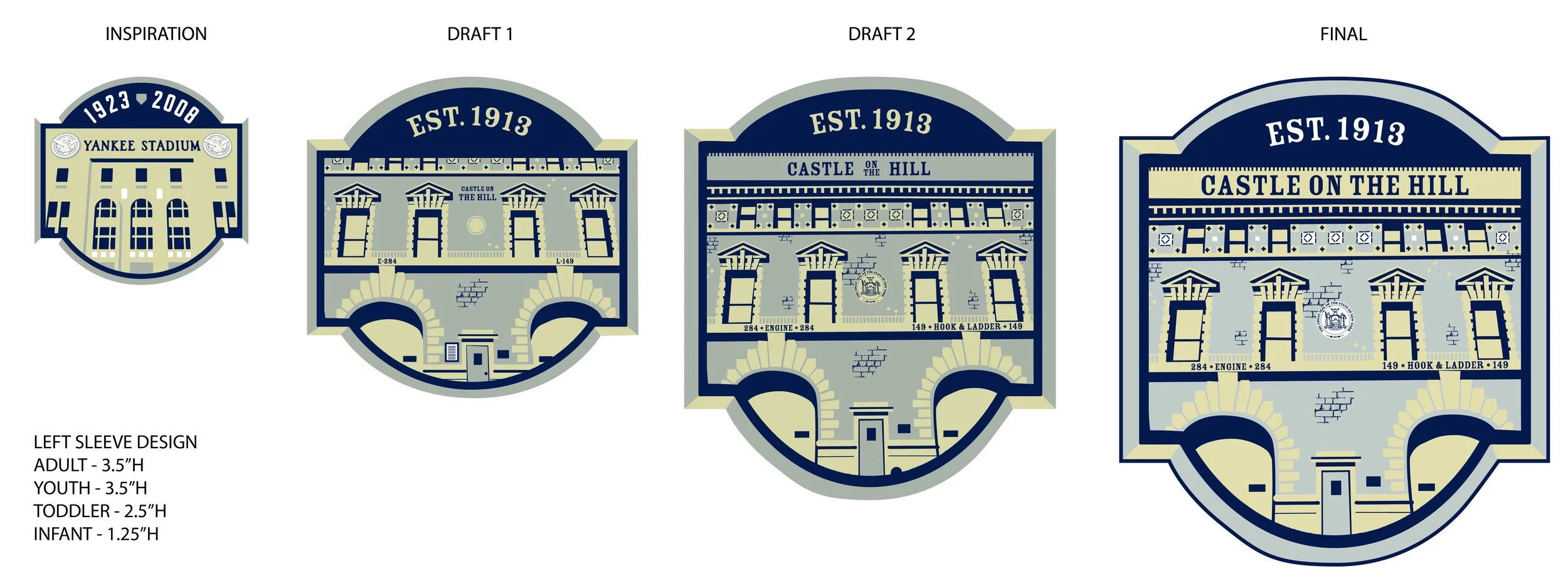
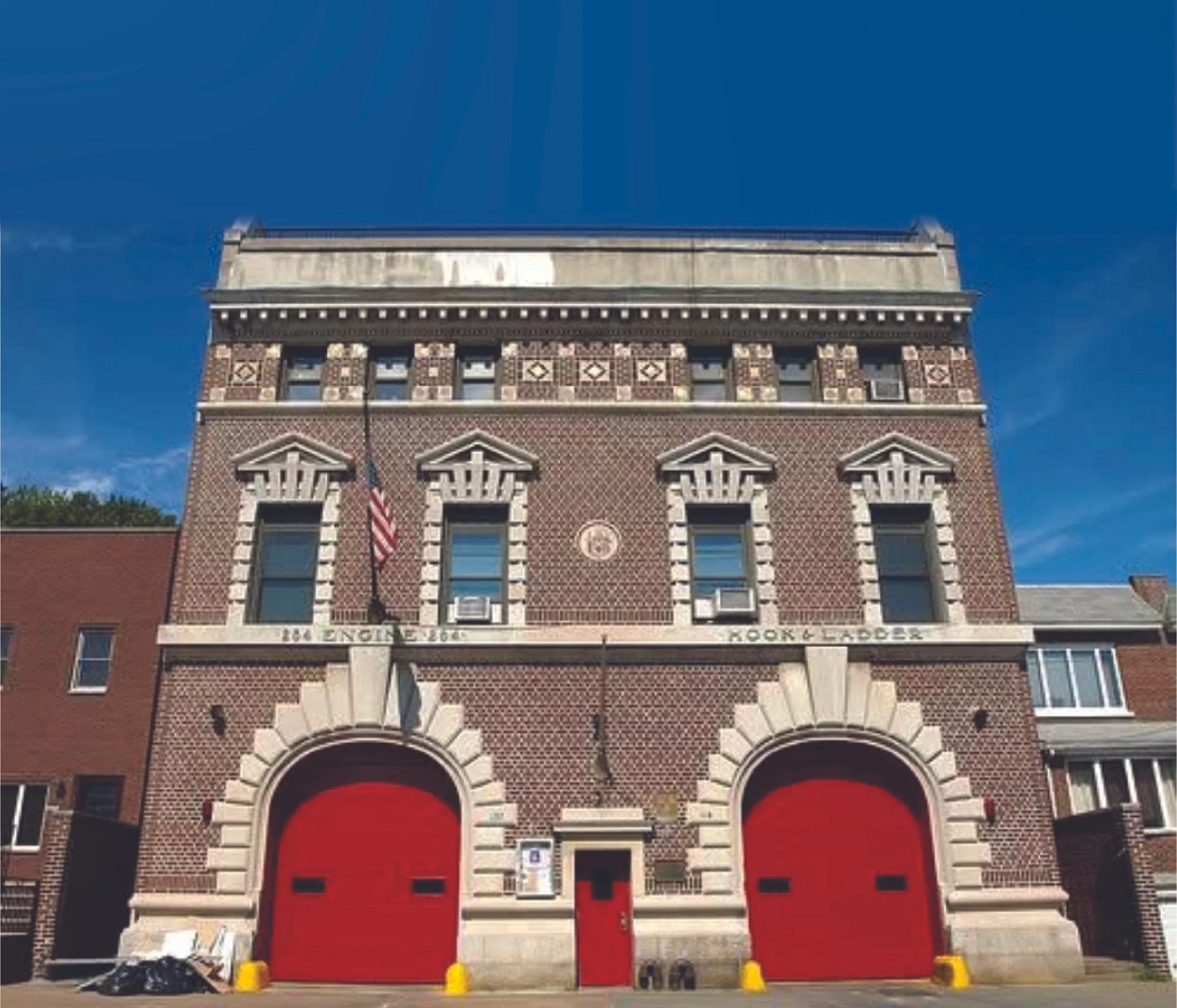
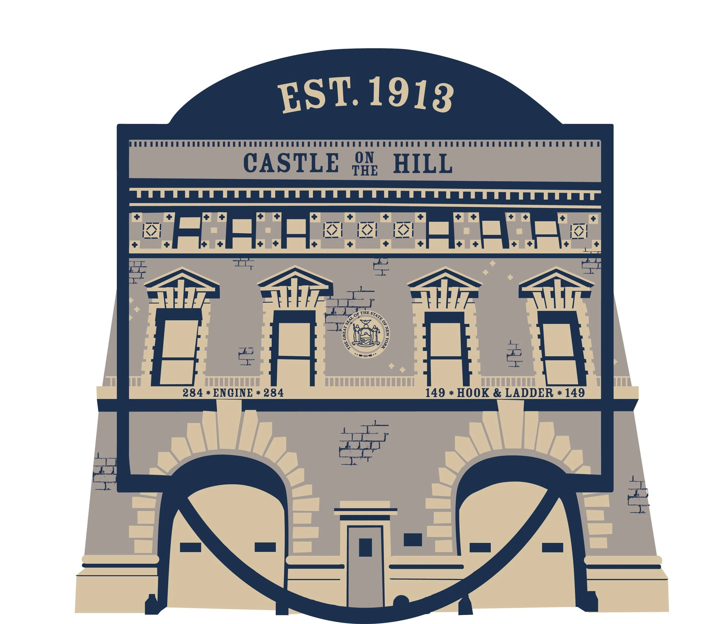
The most time-consuming element was the left sleeve. The client wanted to replicate the Yankees Station badge but with a custom twist: an illustration of their actual station house. Using a reference photo, I recreated the station in Adobe Illustrator, drawing it by hand with the Pen Tool in the same minimalistic style as the original badge. One of the biggest challenges was translating a full-color photo into a clean, three-color vector design. Despite the time it took, the process was incredibly rewarding. I especially enjoyed capturing the architectural details—adding subtle linework to suggest brick textures while staying within the minimalist, shape-driven aesthetic.
The sleeve design also featured the station's nickname: “The Castle on the Hill,” a tribute to both their location on Castle Hill Avenue and a phrase deeply tied to their identity.
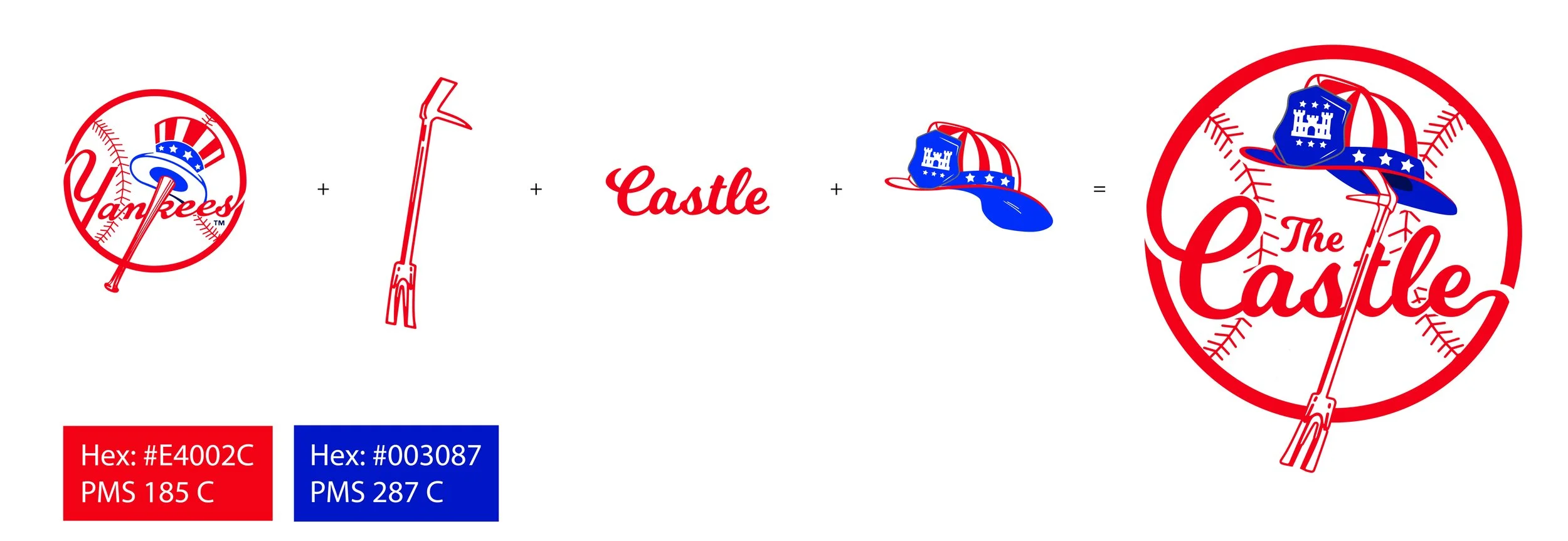
The full back design drew inspiration from the classic Yankees logo: the red script over a baseball, the bat forming the "K", and the Uncle Sam hat perched on top. I reimagined each of these elements to reflect the spirit of the firehouse. “The Castle” replaced “Yankees,” a halligan tool (a key piece of firefighting equipment) formed the vertical line of the "t", and the Uncle Sam hat was swapped for a firefighter’s helmet. To maintain a sense of homage, the helmet retained design elements like stars and stripes from the original.
As a student athlete, I especially appreciated the balance of creativity and discipline required for this project. It pushed my skills in illustration, typography, and storytelling—making it one of my favorite design experiences to date.