FDNY Mets
Client: Michael Farrugia
For this project, I partnered with the FDNY to create custom swag for their attendance at a Mets game. While the client initially approached me with a few design ideas, I took the lead in developing original concepts using Adobe Illustrator. Throughout the process, we collaborated closely via email, exchanging feedback and refining the designs. I maintained clear communication and responded promptly to ensure a smooth and efficient workflow, delivering high-quality visuals with quick turnaround times. Once the mockups were approved, I prepared the art files, ordered DTF (Direct-to-Film) transfers, and coordinated production to ensure everything was completed on time. Strong communication and proactive project management were key to delivering a smooth and successful outcome.
Final
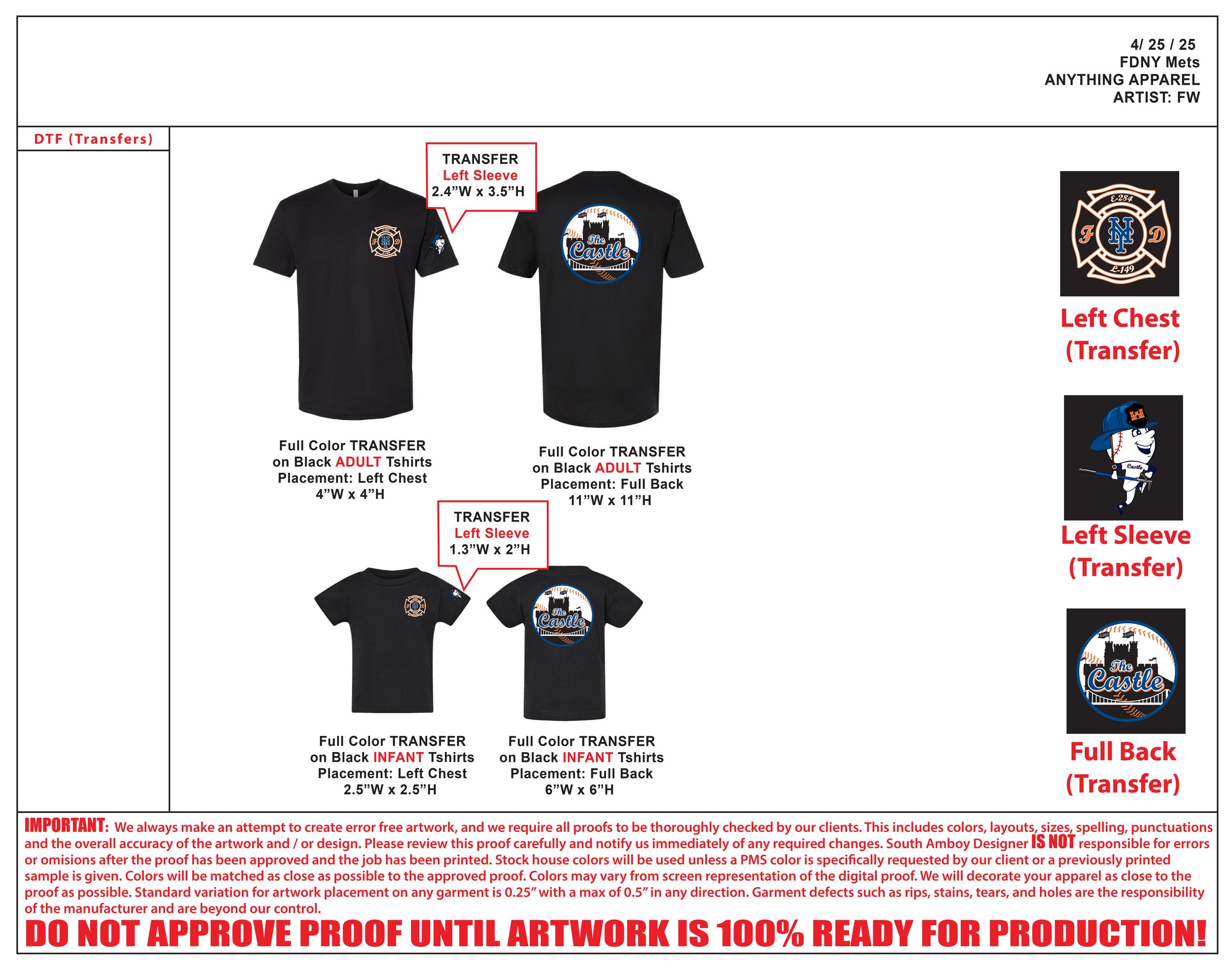
The final designs were tailored to complement the garment colors, with adjustments made to ensure strong contrast and visual impact. Each piece featured three design placements: Left Chest, Left Sleeve, and Full Back. I created mockups to clearly show how the artwork would appear on different shirt colors, helping the client visualize the final product before production.


Progress
This section showcases the development of the FDNY Game Day swag, from initial concept to final design. The client requested a design that paid homage to both the Mets and the FDNY, with the specific ask to mimic the Mets logo font. I sourced a font that closely resembled it and built the rest of the design around that foundation. From the start, the client specified two different shirt colors, which required adaptive color palettes to ensure the designs stood out on each garment.
For the Left Chest, I incorporated the iconic Maltese Cross—symbolizing heroism and fire service—along with the Mets logo and the station numbers.
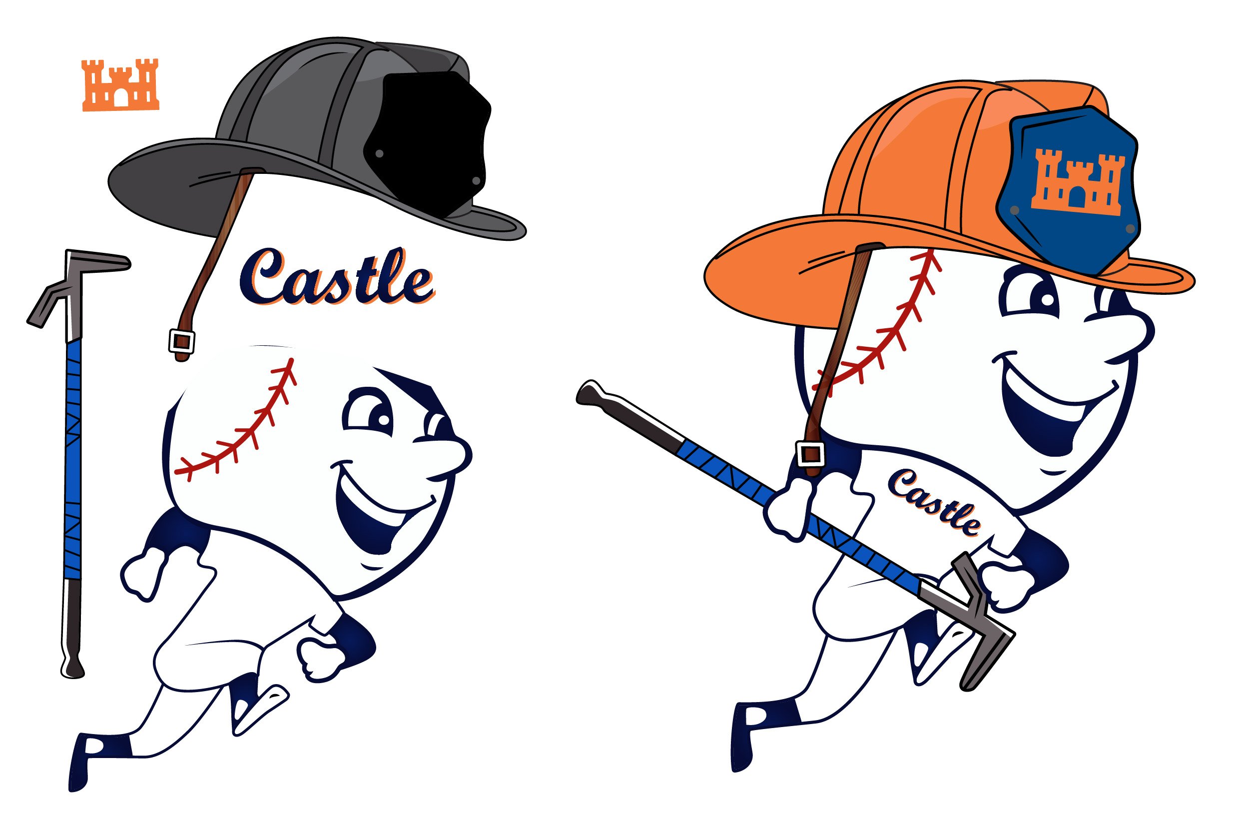
The Left Sleeve featured a custom illustration of Mr. Met dressed in firefighter gear, complete with a hard helmet and a Halligan tool. Using reference images, I pieced together his outfit and customized the helmet with a castle symbol. This castle represents their nickname, “The Castle on the Hill,” a nod to their location on Castle Hill Ave and a recurring emblem in their station's identity.
The Full Back design was both the most challenging and the most rewarding. It was inspired by the classic Mets logo but replaced the NYC skyline with a custom castle silhouette. Flags flying atop the castle symbolized different station numbers and departments, making it a personal and meaningful design for the team.
As a student athlete, I especially appreciated the balance of creativity and discipline required for this project. It pushed my skills in illustration, typography, and storytelling—making it one of my favorite design experiences to date.